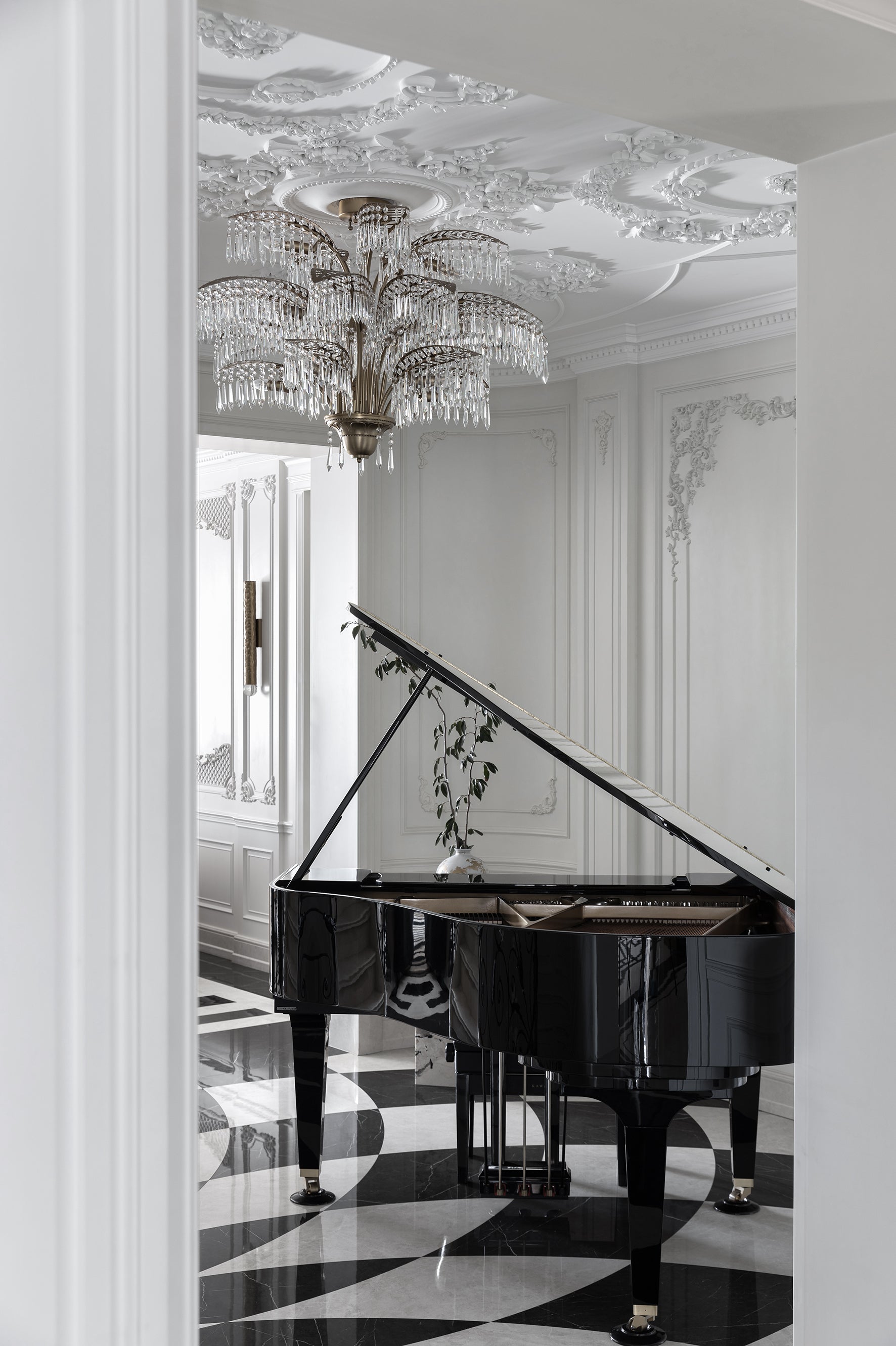
色彩的反叛美学

A Rebellious Aesthetic in Color

如果这片城市的建筑语境是一种“灰色礼貌”,那我们就让这家酒店成为打破静音的那一抹跳色。

项目最初是一幢架空旧楼的半开放空间,只有结构,没有围合,也没有方向。但正是这种“空”,给予了我们足够的余地,让设计的语言不受预设限制,从材质、色彩、动线到情绪,都可以自由地生长。

If the architectural context of this city is a kind of "grey politeness," then we want this hotel to be the bold splash of color that breaks the silence.

The original project was a semi-open, elevated structure with only a framework—no enclosures, no orientation. But it was precisely this "emptiness" that gave us room to grow freely, letting the design unfold in material, color, circulation, and emotion without constraint.


我们首先从建筑结构入手,对整个功能系统进行了重构。大堂、餐厅、厨房、后场、客房之间的流线完全推翻重排,我们不仅为每一个功能赋予了更高效的路径和分区,也保证中轴线上的自然采光与通风——这一点,在原先零散的架空层空间中几乎是不存在的。

设计的第一步,不是“装饰”,而是让这个空间拥有呼吸的能力。

We started with the architectural structure, completely reorganizing the functional system. The circulation between the lobby, restaurant, kitchen, back of house, and guest rooms was entirely redesigned. We gave each function a more efficient layout and ensured natural light and ventilation along the central axis—something the original scattered elevated structure lacked.
The first step in design is not decoration, but giving the space the ability to breathe.


线条,是我们选择的设计语言。不同于传统酒店多用的平直边界和方形框架,我们大面积使用了弧线、圆角、曲面墙体与“波纹式”灯带,将整个空间软化。这种流动感不仅存在于天花与地面,还渗透进家具、台面、陈设的边缘。

这源于项目临江的区位灵感,我们将水的韵律抽象化处理,让它像是一种空间节奏,在视线中展开、在步伐中流动。

Line is the design language we chose. Unlike the straight boundaries and square frames used in traditional hotels, we applied curves, rounded corners, curved walls, and wave-like light strips extensively to soften the entire space.
This sense of fluidity exists not only in the ceiling and floor but also in the edges of furniture, countertops, and décor. It was inspired by the project's riverside location—we abstracted the rhythm of water to create a spatial rhythm that unfolds visually and flows with every step.


色彩是这个空间的第二层“骨架”,更是它的“灵魂”。黑白灰构成背景基调,像是一块安静的画布,而大面积的暗红色、被安排在关键转折处,激发记忆点。

餐厅中使用灰色条纹大理石,和白绿色的整体色调融合,从过渡休息空间红砖到这里的绿,让“跳色”成为一种理性组织,而不是任性拼贴。

Color is the second layer of the space’s framework—and its soul. Black, white, and gray form a calm background, like a quiet canvas, while deep red is applied in key transitional areas to trigger memory.
The restaurant features gray-striped marble, blending with the overall palette of white and green. From the red brick lounge area to the green dining space, these contrasting colors are rationally organized rather than arbitrarily assembled.


材质选择上,我们同样强调“视觉背后的温度”:布艺选择吸音能力强的编织织物,金属框与地面拼接处都采用弧形收边处理;而灯光系统采用分区冷暖调节模式,在白天保留清透的结构感,晚上则营造包裹式的情绪氛围。

每一件家具,每一处灯光,都像是空间主动伸出的手——邀请你靠近,而不是说服你留下。

In terms of material selection, we emphasized the "warmth behind the visuals": we used woven fabrics with strong sound-absorbing properties, and all connections between metal frames and flooring were curved.
The lighting system uses adjustable zones with warm and cool tones—preserving clarity during the day and creating a cocooning emotional atmosphere at night.
Every piece of furniture and light fixture feels like an extended hand from the space—inviting you in, not trying to persuade you to stay.

我们从不刻意“讨好年轻人”,但我们愿意为他们设计一处“不是复制品”的空间——不照搬样板、不打卡式模仿,而是真实、稀有、有态度的表达。

你不会在这里看到标准前台、排布雷同的沙发、或“中性得没有情绪”的陈设。你会看到一张弧形的中岛前台,可以前后同时使用的悬浮台面;一排卷边弯曲的灰蓝沙发,像浮在水上的岛屿;还有天花灯带投下来的柔光,在你走动时一起起伏。

We never deliberately try to "please young people," but we do design spaces that aren’t just copies—for them or anyone else.

No template replications, no social media aesthetics—just something real, rare, and expressive.

You won’t find a standard reception desk, a repetitive sofa layout, or bland, emotionless décor. Instead, there’s a curved island reception with a floating surface usable from both sides, a row of curled gray-blue sofas like islands floating on water, and soft lights from the ceiling that rise and fall as you walk.


这个项目荣获了2024年伦敦设计奖白金奖。

它的被看见,不是因为它有多“国际”,而是因为它够真诚。在今天这个一眼望穿风格套路的时代,真正让人留下印象的,是那些“有点不一样”、但又“恰到好处”的空间。我们没有用浮夸的材质,也没有“强调风格”,我们只是尊重这个城市、尊重每一个走进这里的人,想为他们创造一段更真实的停留感受。

This project won the 2024 London Design Awards Platinum Prize.
Its recognition didn’t come from being "international" but from being sincere. In a time when style formulas are easily predictable, what truly leaves a lasting impression is a space that is "a little different" but "just right."
We didn’t use flashy materials or emphasize a particular style. We simply respected the city, and everyone who walks into the space—hoping to offer them a more authentic stay.

最终,这不只是一家酒店,更像是一段空间体验:你也许只是经过,却想多看一眼;你也许只是住一晚,却愿意记住那抹光、那张椅子、那道转角处静静展开的线条——不需要“风格”的宣告,也无需“潮流”的依附。它只是安静地存在,如一首低语的诗,一场关于感官、记忆与秩序的叙述。

In the end, this is not just a hotel—it’s a spatial experience.
You might just pass by and want to take a second look; you might only stay one night, but you’ll remember that light, that chair, that quiet line around the corner.
It doesn’t need to declare its style or follow a trend.
It simply exists—like a whispered poem, a narrative of senses, memories, and spatial rhythm.

探索更多灵感案例,感受风格的融合、材质的对话与光影的演绎

——设计,从来不仅止于美。

Discover more inspiring projects—where style meets substance, material speaks, and light becomes design. Beauty is just the beginning.

阅读更多/Read More

设计咨询预约

Book a Design Consultation

美学沙龙报名

Join an VogueLiving Salon

产品集浏览

Explore Our Collections